Welcome to the digital handout for the Fostering Supportive Environments for Children and Families session as presented at the Kentucky Early Childhood Institute in May 2025. We like to provide materials this way so that we can continue to update the information and make changes as needed.
Presenters

Materials and downloads
Accessible meeting tips
Course outline
What is accessibility?
Accessibility means making things usable for everyone, including people with disabilities. The goal is to ensure that no one is excluded from using or enjoying something because of a disability.
When materials aren’t accessible, we have to make changes or add supports for each person or type of impairment. These changes are called accommodations.
- Direct access lets people use your product or service without needing extra help or special tools. For example, permanently replacing the steps to your front door with a ramp or flat entrance makes access easier for someone with a disability.
- Indirect access means someone with a disability can use a different tool or method to use your services. An example would be making sure people can fill out your online forms using voice typing.
Talking about disability
When it comes to talking about people with disabilities, we want to recognize that they are more than their limitations. Every person feels differently about their identity but there are two main ways to talk about the subject, and each has a different focus.
Person-first language
- Person before disability
- Not defined by their condition or limitations
- Person “has” or “experiences” disability
Identity-first language
- Disability as community or culture
- Show pride in being a part of it
- Common in the autistic and Deaf communities
The most respectful thing you can do is to ask the person or family directly what language they prefer. Apart from that, use person-first language as your default. Whether you use person-first or identity-first, make sure that you keep it positive. For example, you wouldn’t refer to someone as “handicapped”, “wheelchair bound”, “wheelchair dependent”, or “crippled”. For that person, a wheelchair is actually a tool that enriches their life and allows them to be part of the world around them! Instead, try “someone who uses a wheelchair” or “people using mobility devices” instead.
Person-first examples
- a child with Down syndrome
- someone who has difficulty climbing stairs
- students with learning disabilities
- Tomithy has a hearing impairment
Universal design
Universal design is a different way to approach accessibility. In universal design, we try to think about what the accessibility challenges are from the beginning. Instead of making accommodations, we try to plan ahead to make sure we don’t create barriers that need accommodation later.
7 principles of universal design
- Equitable use: Your design or product can be used by people with all levels of ability. Think about automatic doors that open for someone with a walker or wheelchair.
- Flexibility in use: You build things that apply to a wide range of abilities and preferences. Those automatic doors help folks with mobility problems but also a busy customer pushing a child in a shopping cart or someone walking out with a 55-inch television.
- Simple and intuitive use: Whatever you’ve built, it’s easy to use without experience, training, or special language. We’ve shared this document in PDF format so that you don’t have to download a special expensive software program to read it.
- Perceptible information: The information can be understood no matter what the environmental conditions or the user’s abilities are. For example, you notice that the elevator buttons are marked with both large text and braille labels.
- Tolerance for error: You’ve helped reduce the chance that a mistake will have serious consequences for your users. This is why your banking app and PayPal make you confirm the amount before you complete your transaction. Make sure you’ve got the right number of zeros!
- Low physical effort: Easy operation without wearing out your users. For example, a lever-style doorknob doesn’t require grasping, twisting, or turning like a round one does.
- Size and space for approach and use: Plenty of room to access and use your product. A great example would be an accessible sink that has space for a wheelchair user to roll underneath.
Why you should create with universal design
Universal design might seem complicated and difficult at first. Making an effort early on saves you time in the long-run, though. You save the extra expense and effort of making accommodations later. You also make everyone who uses your product or visits your center feel welcome. They can access things in the way that works best for them without having to talk to you or admit that they need something extra.
Universally designed communications and instruction make things more understandable and user-friendly for everyone, not just folks with disabilities. You can design templates, forms, and master copies with the universal design principles in mind. That makes it much easier when you need to make new materials later since you’ve already fixed a bunch of potential problems.
Why does access matter?
When environments, products, and services are accessible, people of all ability levels feel like they are included. In a more accessible world, they:
- can engage in activities, access information, and use tools just like everyone else
- feel a sense of belonging and equality
- are not left out or made to feel different because of their abilities
- feel like part of an inclusive and supportive community
Universal design in your ECE program
Instruction
For teachers and caretakers in Early Childhood Education, it’s important to understand the needs of kids with disabilities. It’s not a question of IF you will serve a child with a disability; it’s only a question of WHEN. Some learners will need a little more attention or an accommodation in the classroom. Others might need more support from therapists or parents in the classroom.
When you plan your learning activities or give directions in class, keep the universal design principles in mind. Remember: If you make the instructions understandable for all of your students from the beginning, then you won’t have to repeat yourself by explaining it over and over again in individualized ways. Use plain language and simple instructions so that everyone can follow along.
Follow the same rules for organizing and storing materials in your classroom. For example, label the box of cooking tools in your kitchen activity center using both words and a picture! Be sure that all children can pull out your toys and materials without needing to ask for special assistance.
Communicating with parents & families
Think about how you reach out to your families and clients. What tools and technologies do you use most often? Do you use management software to handle messaging? Do you use texting, phone calls, or social media for publishing announcements? Do you send home printed flyers and forms with students? Which methods have you found to be the most effective? Easiest for your staff?
When you think about reaching out, think about how you can make sure that everyone gets the information in a way they can access. This includes operational things like assignment details and special events. It’s also very important for special communications like weather closings and non-traditional instruction assignments when they come up. Just like with instructional materials, you need to provide outreach materials that give clear instructions and use plain language. Let the viewers or readers know exactly which page from a packet needs to be returned, for example, or the special procedures for an upcoming field trip day. Include maps or other helpful visual information, too.
Universal design tells us that we can help everyone find what they need by being consistent with the ways we share it. Let families know from the start how they should expect to get messages from you, the best ways to contact you, and where they can go for information on inclement weather and other closings.
Marketing and recruiting
Accessible marketing and recruitment materials are especially important. You don’t know exactly who might see this stuff so you want to make sure everyone can understand the information! The same rules apply whether you are trying to recruit new children and families or new staff for your program.
Think about the accessibility of everything you send out. This includes flyers, family and new employee handbooks, and application forms, as well as any materials you share on your website or social media accounts. Make sure all of them are simple and intuitive to use and that the information is presented in more than one way.
Universal design techniques and best practices
Plain language
Try to use plain, simple language when creating materials. You aren’t talking down to your audience – you are just using simple language to avoid confusion and to make sure your writing can be understood. Avoid big words, technical jargon, and complicated abbreviations wherever possible. You never know how the audience will access your information! Let’s say you’ve created a flyer for an upcoming ice skating party. You sent the flyer home in students’ backpacks and posted it to your social media. Imagine that at least one parent or caregiver from your class will:
- Have their phone read the social media post to them out loud while sitting in traffic
- Stick the paper flyer under a magnifying camera to see it on a large screen
- Read the paper flyer, crumple it up, throw it away, and then dig it out of the trash three days later
- Take a picture of the paper flyer (or screenshot of the digital one) and never look at it again
- Have a sighted person read it to them aloud
- Have a child read it to them aloud
- Forget about it in the backpack folder and find it the day before the party
- Forget about it in the backpack folder and find it the day after the party
- Try very hard to read it in spite of low literacy
- Try to understand it even though English is not their native language
- Need to google ‘skating party’ to find out what that is
- Need to google the skating rink to see if it’s a place they feel safe sending their kiddos
- Scroll past the social media flyer while waiting in line at the grocery store
- Search Facebook for details because they can’t physically pull the sheet of paper out of the child’s backpack
- Search Facebook for details because their kid lost the flyer out of their backpack between your classroom and the car
Example (bad) flyer text
For the preschool skating party, it’s important that each child comes prepared with a few necessary items like socks to wear with the skates and their own helmet if they happen to have one available. They also need to dress in clothes that are comfortable and will allow them to move freely on the ice, plus it would be a good idea for them to bring a water bottle to stay hydrated while they’re having fun, and finally, if a child has their own ice skates that fit well, they should bring those along too.
Plain language flyer text
A few reminders for the skating party:
- Wear socks.
- Bring your own helmet if you have one.
- Wear comfortable clothes you can move in.
- Bring a water bottle.
- If you need them, bring your own ice skates.
Using color
Images and color are great ways to add visual interest and extra context to your work. Just remember that those things don’t work for everybody! You just never know when someone might print your digital file and make photocopies on a black and white copier, for example, or share a blurry, dark photo of a child’s progress report. Color can be used as a shortcut for information or as a visual grouping like a border or background.
Color contrast
Contrast is the difference between the brightness of 2 colors. When you’re creating documents, emails, or web pages, you’ll want to make sure that the text and background colors are different enough to see easily. We measure contrast as a ratio; the higher the ratio, the better the contrast. Text should have a contrast ratio of at least 4.5:1 compared to the background color.
Color contrast testing tools
- WebAIM: Contrast Checker
- Color contrast checker analyzer tool | Adobe Color
- Colour Contrast Analyser (CCA) – TPGi
Conveying information
One important tip is not to use color as the only indicator of information. You should plan ahead for the effects of copying, reproduction, and scanning. There is always the possibility that some of your audience might have colorblindness (in the U.S., that’s 8% of men and 0.5% of women). You want to make sure that these folks aren’t being left out! Check out the example behavior report below. The staff is still able to use color coding the way they want but in a way that can be reproduced without color and not lose meaning.
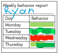
The teacher uses a red or green highlighter to mark the child’s behavior for the day.
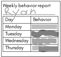
When you look at the chart in black and white, you can’t tell the colors apart.
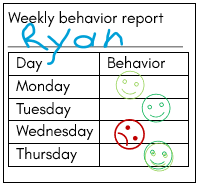
Using colored stamps with smiley and frowny faces makes this easier to read.
Text alternatives
When you include photos, videos, or other media in your materials, it is important to include a text alternative as well. People who have trouble seeing, hearing, or processing information should still be able to find all of the details, even if they can’t find them in the same way. It’s the purpose of the perceptible information principle of universal design. Some common examples of this include closed captioning for TV shows or videos and text descriptions for pictures.
Keep in mind that you are just trying to fill in the important information someone would miss if they couldn’t see the page. Limit your alternative to the story it’s there to tell. You don’t need to describe an entire beach photo, for example, if the purpose is to show off the sandcastle. Your readers don’t need to know other details like other tourists, an umbrella, or how many waves you can see in the background.
Social media
Social media can be a great tool for sharing information with families and your community. Websites like Facebook, LinkedIn, or X.com were built to be simple to use and you’ll find that most of your audience already uses them. When you are creating social media content, remember everything you’ve learned so far. Use plain language and make sure you are using color correctly with good contrast. If you are using an image such as a photo or flyer along with your post, make sure that you include the important details in the post text as well.
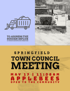
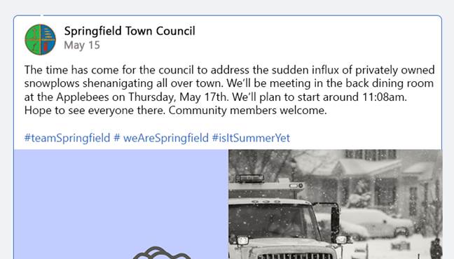
The flyer, left, contains information about an upcoming town council meeting. The social media post, right, includes the date, time, and location for those who can’t see the flyer.
Preparing for visitors
At some point, you will definitely have visitors in your classroom. This could be families coming in for parent-teacher conferences, potential clients who want a tour, or inspections of your program. You can set yourself up for success by planning ahead and putting your universal design skills to use. Let’s take a look at things you can do to make your visitors feel welcome.
Before your meeting
As we’ve been discussing, your audience can’t use the information you send them if they can’t find or understand it. The same is true when planning for meetings. You’ll want to make sure that you give attendees as much information as possible ahead of time so they know what to expect. Here are a few things you can do to make sure everyone ends up in the right place and has their needs met:
- Send out invitations and reminders that are accessible.
- Share important facility information like gate codes, information desks, parking, or GPS location if it’s different from the street address.
- Include an opportunity and contact information for attendees who want to ask for accommodations.
- Keep an updated list of translators and interpreters in your area. Make sure that you account for common foreign languages in your area as well as an American Sign Language (ASL) interpreter for deaf attendees.
On the day
On the day of your meeting or visit, there are a few more details to make sure of. They are especially important if your meeting is off-site or not in your regular classroom environment,
- Check for a well-marked route from the parking lot to the building entrance.
- Let the receptionist or staff know that you are expecting visitors and how to direct them.
- Make sure there is an accessible route from the entrance to the classroom or meeting space. You might have to move clutter or furniture to remove hazards.
During your meeting or presentation
Universally designed meetings help everyone participate. They make things easier for you as the organizer because you don’t have to spend so much time and effort making accommodations for specific people. It’s easy to see how keeping the 7 principles in mind benefits attendees of all abilities.
- Open the meeting with clear goals and expectations.
- Offer to show questions to the visitor in written form. Make it clear that it’s okay for them to take a moment to think before responding.
- Be aware of everyone’s attention levels and mental fatigue. If someone has completely stopped interacting or responding, or is clearly not paying attention, suggest a short break to allow all parties to refresh.
- At the end of the meeting, make sure everyone understands the next steps. What does each attendee need to work on? If there is a deadline or follow-up, go ahead and schedule it now.
Accessibility and accommodations
You will have a visitor or attendee at some point with a disability. As you make plans and create universally designed experiences, you will need to think about the possible barriers that people could face. The lists below include some common accommodations – changes you make by request for individual attendees. We’ve organized them by the disability type. Your goal should be to include these in all meetings. They can help many people, regardless of ability.
Hearing
- Make sure people can see each other. Watching the speaker’s lips helps people focus and process verbal information and more than 2/3 of what we communicate is non-verbal (emotions, body language, and etc.).
- Consider using microphones for amplified sound without background noise.
- Be prepared to provide alternative communication using a live captioning app, induction loop, or FM system.
Vision
- Be ready to provide documents in an alternative, more accessible format.
- Be prepared to read vital information aloud or to provide technology that can do so.
- Make sure that the meeting space has good lighting and minimal distractions. Avoid florescent lighting where possible.
Physical barriers
- No door or transitional thresholds
- Avoid stairs, narrow hallways, and narrow doors
- Remove obstacles and excess furniture
- Leave 36” around furniture for navigating
- Tables and lecterns at roll-under height
- Comfortable climate and temperature
Executive function
- Provide attendees with a schedule or agenda and a pen for jotting notes. Let them know upfront if you will be sending a summary or transcript.
- Minimize distractions
- Block view of doors and windows that could be distracting
- Verify that the visitors understand the information as you go